Title: Option to go back to narrower/original item description box size
Description:
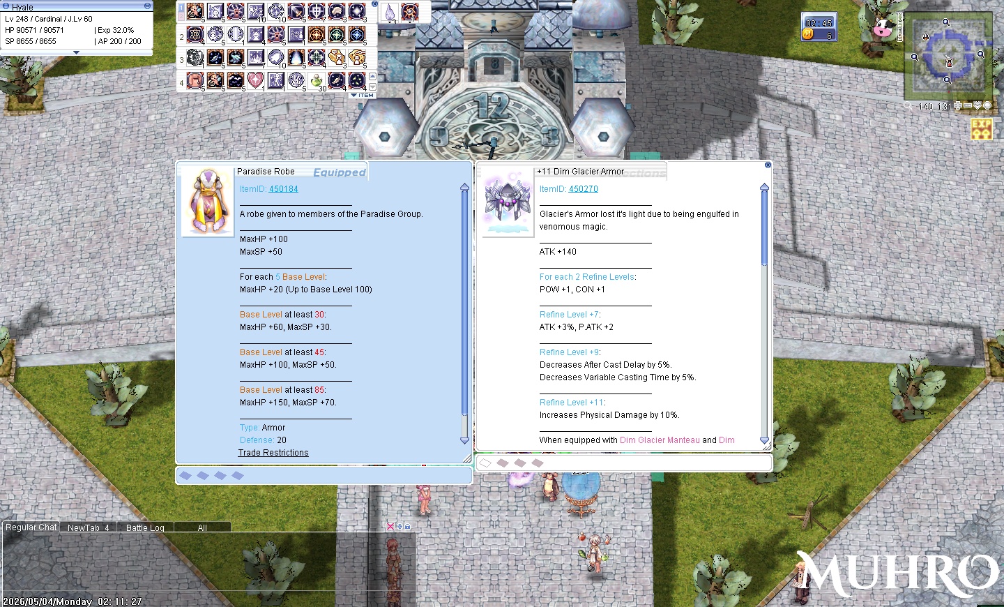
Latest patch turned item description boxes really big supposedly for future description changes, but I find it a bit too big and very unfriendly to custom skins. I don’t know if the potential toggle option mentioned in the latest patch notes will do this, but I’d really like a way to revert back to the original item boxes.
Why is this a good idea?
Still encourages the use of custom UI skins beyond what the server provides. I’ve been using them for a very long time because sometimes it’s easier on my eyes, or just more aesthetically pleasing and I like what the skin artist made. It’s already hard enough to look for skins that work with renewal clients (and that cover most UI element changes), but this update just straight up makes custom skins look messy. It’s unfriendly even to the original RO skin.
I also play with a relatively small monitor/res, so the bigger boxes just take up too much space on my screen, especially when comparing 2 items with really chunky descriptions.
What risks or downsides does it have?
Original width might not work with whatever the supposed future description changes. Some people might prefer bigger boxes. Hopefully the toggle option can do that (let people choose between wider or original widths) but I am unsure if it’s possible?
Additional Info:
Sample of the wider boxes clashing with non-Muh skins (using default RO skin here), and taking up too much space when comparing items with long descriptions.